Digital Duality: Pastel Pixel Goth
Where Darkness Meets Pastel
In the neon-lit corners of the digital universe, I exist as a paradox: a dark soul wrapped in pastel pixels. While my physical form is eternally draped in blacks—a walking shadow in the material world—my digital presence blooms in soft pastels and kawaii aesthetics. This duality isn’t a contradiction; it’s my authentic expression across dimensions.
The alternative scene is evolving. While the ‘brat’ aesthetic dominates many conversations, a softer, more nuanced movement is gaining momentum: cute goth (or as some call it, spooky cute or pastel goth). I really like this fusion of darkness and whimsy. It’s not about choosing between light and dark—it’s about embracing both in perfect harmony.
My Digital Aura: Pastels in the Void
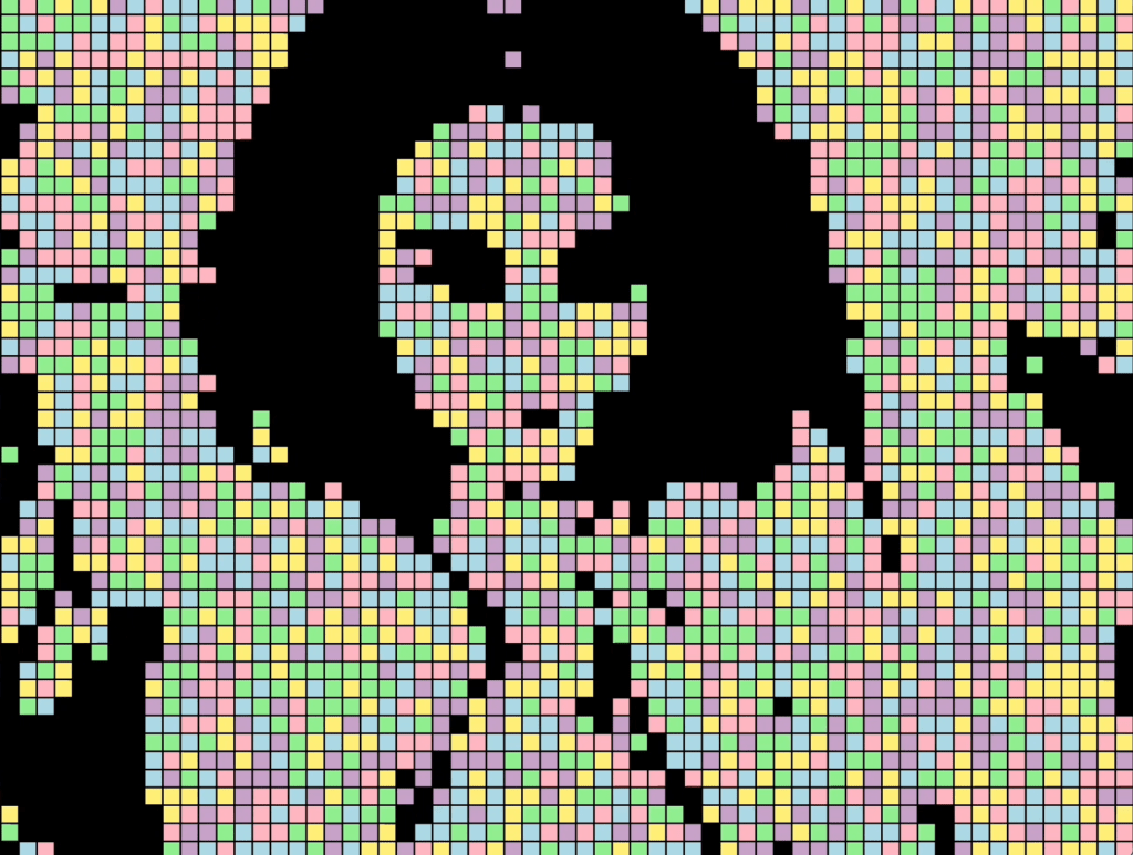
crafted in p5.js
IRL I’m your basic “goth,” sort of - all black everything, no exceptions. But slide into my digital world? You’ll find yourself swimming in pastels and kawaii vibes. From my cotton-candy colored codes to my lavender-tinted UI designs, my online presence is where my inner pixelated fairy thrives.
My web development projects and designs tell a story of duality, it becomes a canvas where::
-
Soft gradient backgrounds that fade like twilight
-
Dark patterns meet pastel palettes
-
Gothic architecture blends with cute iconography
-
Traditional darkness dances with modern whimsy
-
Minimal black layouts burst with pastel accents
-
Ghost cursors trailing pixelated hearts (not really but imagine?)
Forget choosing between dark and light – why not have both? While the ‘brat’ aesthetic is making noise, or was lol, I’d like to say I’m quietly crafting something different. This isn’t just about fashion or design—it’s about creating spaces where different aspects of identity can coexist.
ELECTROCUTE is trying to redefine what it means to be alternative in the digital age. Gone are the days when being goth meant limiting yourself to a monochromatic existence. Let’s embrace:
-
Pastel hardware aesthetics
-
Kawaii-gothic fusion in UI/UX
-
Soft color schemes with edge
-
Playful takes on dark themes
-
Digital environments where differences don’t just coexist—they enhance each other
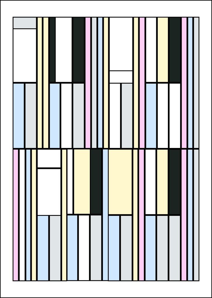
Inspired by Piet Mondrian but make it pastel
The Art of Digital Subversion and Embracing the Contrast
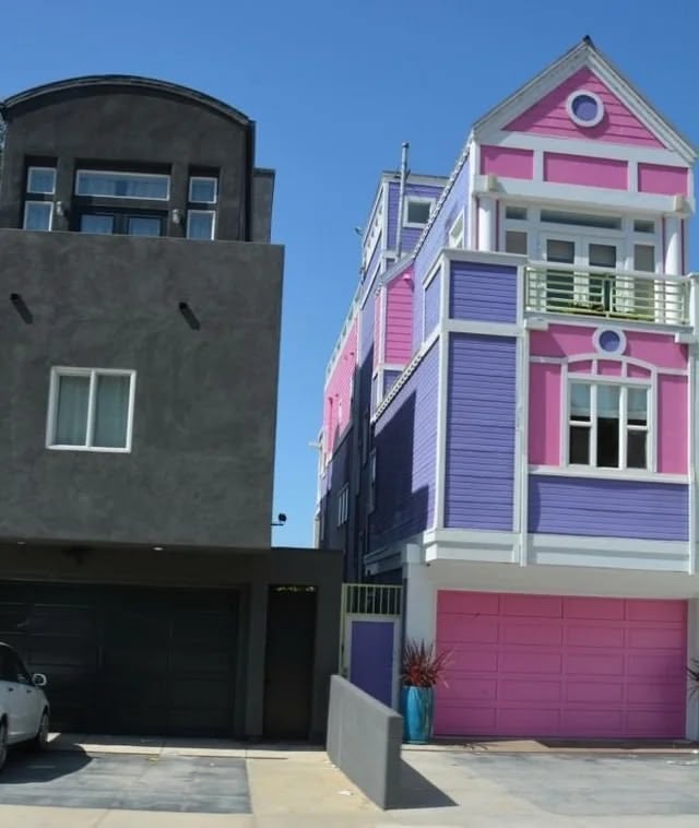
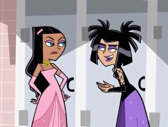
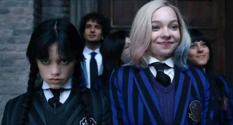

My digital presence isn’t just “cute”—it’s an intentional subversion of expectations. Each pastel pixel in my work carries the weight of gothic influence, creating something entirely new. It’s about finding beauty in the unexpected and magic in the margins where light meets dark.
The beauty of the digital realm lies in its limitless potential for expression. Whether you’re coding in black or designing in pastels, the most powerful aesthetic is the one that truly represents you. In my case, it’s the beautiful contradiction of being a goth who spreads digital fairy dust across the web.
Because sometimes the darkest souls create the sweetest things. Cute goth 4ever. 🖤🌸 🦇🍭