$ npm i electrocute-ui
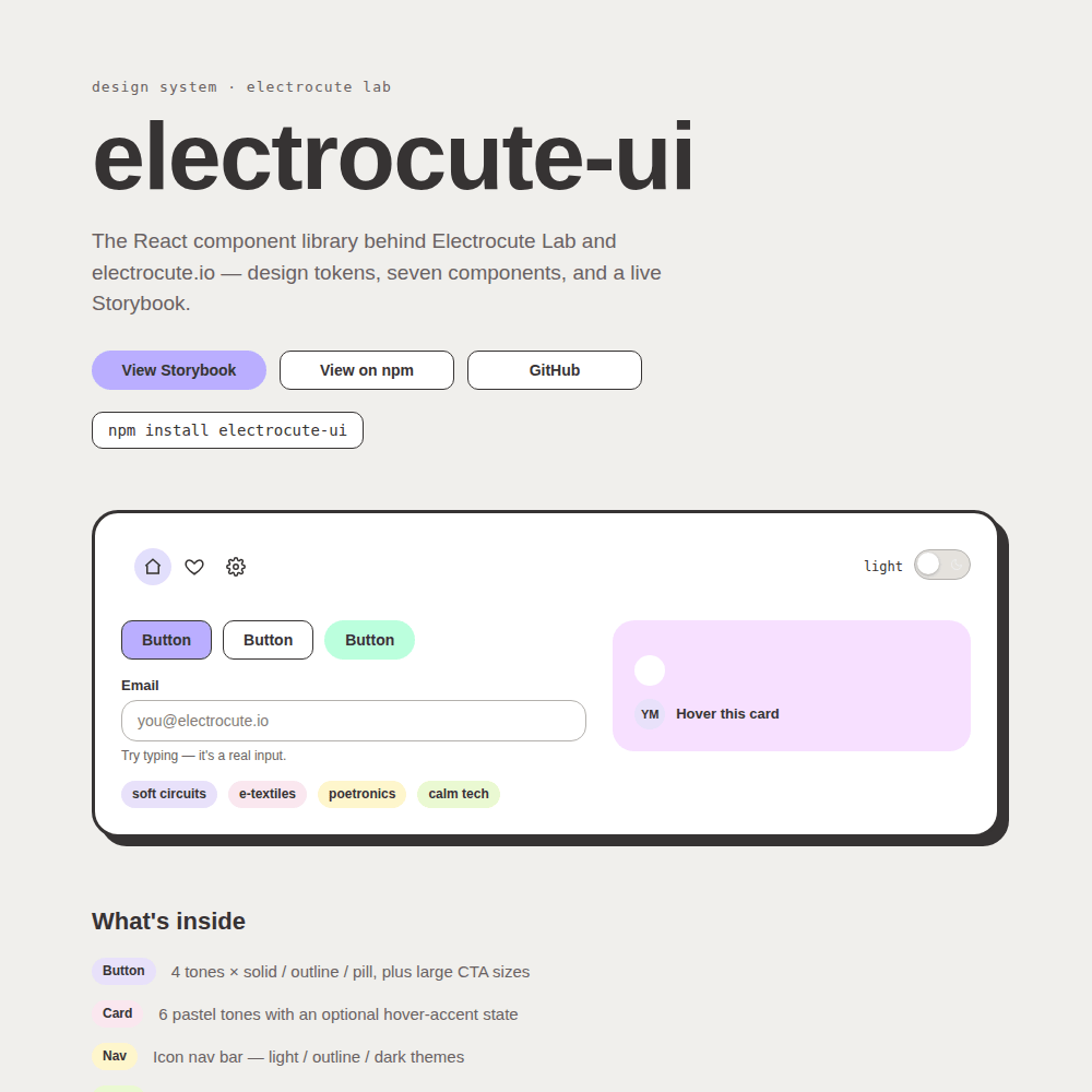
Three years ago I started a design system. I had a Figma file, a few color palettes named things like “goth grunge” and “sweet mochi,” some buttons, some cards. And then I just… stopped. It sat there. “A mini design system in the making. Ongoing” — that’s literally what my portfolio said about it, for three years, while it did nothing.
Today I shipped it.
Not “cleaned it up a little.” Shipped: published on npm, a live component library, a working Storybook, its own custom domain. The thing that lived in a Figma file for three years is now something you can npm install into any project and actually use.
Why Now, Three Years Later
Three years ago, I hadn’t actually gone through the process of packaging something and publishing it to npm. I’d built things, shipped sites, written real code — but this specific workflow, versioning a library and putting it out into a registry for anyone to install, wasn’t something I’d done yet. So the Figma file just… sat there, because turning “a design system” into “an installable package” felt like a separate, unfamiliar infrastructure step, not because I couldn’t have figured it out.
Design systems are vital in modern engineering because they solve fundamental workflow bottlenecks. They establish a single source of truth, bridge the gap between design specs and code, eliminate UI inconsistencies, and save development time by keeping teams from rebuilding the same foundational components repeatedly.
But standard corporate design systems tend to look sterile, cold, and hyper-neutral. Returning to this project, I deliberately chose a soft, inviting, and playful aesthetic. Web applications should be performant, type-safe, and modular, but they don’t have to look mechanical or corporate. Software can be architecturally robust while remaining expressive, distinct, and deeply human.
Coming back to it now, managing a release pipeline isn’t an obstacle anymore. I opened my old file, looked at the colors I’d picked years ago, and realized I knew exactly how to establish a proper automated distribution workflow.
Starting From the Actual Source
Instead of guessing at hex codes from memory, I went back and pixel-sampled the actual swatches from my Figma export to preserve the design tokens. Every color in the library right now traces back to a real value I picked years ago, not something I made up fresh:
export const themeTokens = {
  colors: {
    lavenderBeam: "#E6E6FA",
    peonyFizz: "#FFD1DC",
    marzipanCloud: "#F5F5DC",
    pistachioSwirl: "#D8F3DC",
  },
};
It felt important to respect past-me’s structural decisions even while rebuilding the underlying component framework around them. And I renamed all the tones from boring words like “purple” and “pink” to descriptive names, because a pastel dessert palette should sound like one.
The Button Grid, For Real This Time
Four tones, three variants each: solid, outline, and a fully-rounded pill style. I didn’t even realize I wanted a borderless look until I closely audited my old Figma files and noticed the original primary button was designed without an explicit stroke. Catching that subtle detail highlighted the necessity of treating the design file as the source of truth rather than trusting my memory.
Six Card Tones Now, Not Four
I almost shipped this with only four card variants before checking the layout specifications and realizing there were actually six distinct tones. It is incredibly easy to miss core primitives if you rely on memory over systematic analysis.
The Flower Is Me
I wear all black, always have. But everything I make online is pastel: lavender, mint, butter yellow, blush pink. That contrast is basically my whole aesthetic in one sentence, so when it came time to name my signature mark (a little black blossom that sits next to section titles, same as it does in my Figma file), the name wrote itself: Inkbloom. Black flower, pastel world. It’s a real exported component in the library now, not just a static asset. You can import it as a functional React component:
import { Inkbloom } from "electrocute-ui";

export const SectionHeader = () => (
  <div className="header-wrapper">
    <Inkbloom size="sm"/>
    <h2>Core Primitives</h2>
  </div>
);
It’s Real If a Stranger’s Project Can Install It
The moment that actually convinced me this was done, not just “done in my own repo”: opening a completely fresh project that had never seen my source code, running npm install electrocute-ui, and watching my own buttons and cards show up.
That gif is a brand new app. Zero relation to my actual project folder. Just npm i electrocute-ui and there it is — my own colors, my own component API, working exactly like it does in Storybook. Three years of “someday” collapsed into an actual, installable package that exists outside of my own laptop.
The Part Where Publishing to npm Tried to Defeat Me
The deployment pipeline introduced a few legitimate engineering hurdles.
I ran npm publish and hit a wall of red text: 403 Forbidden — you cannot publish over the previously published versions. The root cause turned out to be a state synchronization issue in my environment. Every time I checked a fresh copy of the project, the version field in package.json was reverting back to 0.1.0. The CLI was repeatedly attempting to overwrite existing, immutable releases.
{
  "name": "electrocute-ui",
  "version": "0.3.2",
  "main": "dist/index.js",
  "module": "dist/index.esm.js",
  "types": "dist/index.d.ts"
}
I also investigated dual-publishing to GitHub Packages. However, GitHub Packages serves as a completely separate package registry. It requires distinct authentication scopes and unique package naming patterns, adding build complexity without solving a real consumer problem. I opted to keep the distribution model simple and focused exclusively on the primary npm registry.
Anyway, the build succeeded, and the version settled cleanly after a few iterations.
What’s Actually in It Right Now
| Component | Architecture / Variants |
|---|---|
| Button | 4 tones × 3 variants (solid / outline / pill), plus scale modifiers for CTA sizes |
| Card | 6 pastel tones supporting declarative hoverAccent states |
| Nav | Compositional navigation layout with light, outline, and dark themes |
| Input | Controlled text field with built-in validation layout (hint and error states) |
| Toggle | Stateful boolean switch featuring custom SVG moon and sun icons |
| Badge | Compact inline metadata labels available in 5 contextual tones |
| Avatar | Image fallback pipeline with automated initial generation and tinted backgrounds |
| Inkbloom | The native SVG signature mark exported as a scalable functional component |
Published on npm, documented in a live Storybook, with its own custom domain and a landing page that’s itself built out of the real components (nothing on that page is a screenshot — click the toggle, it actually works).
This Is Not Done, and I’m Glad About That
I don’t want to pretend v0.3 is the finish line. It isn’t. This is genuinely ongoing. The goal is to keep adding components, expanding token customization, and scaling this into a comprehensive library of soft, pastel, highly expressive UI pieces that represent my voice rather than matching a generic UI framework.
The difference between this “ongoing” and three-years-ago “ongoing” is that this one is versioned, published, and real right now, today, at v0.3. The next version just makes it bigger. It doesn’t have to make it exist — that part’s done.
Three years to start. One very long, very good day to finally ship it.
- electrocute-ui@0.3.5 <-- You are here
- electrocute-ui@0.3.4
- electrocute-ui@0.3.3
- electrocute-ui@0.3.2
- electrocute-ui@0.3.1
- electrocute-ui@0.3.0
- electrocute-ui@0.2.0
- electrocute-ui@0.1.2
- electrocute-ui@0.1.1
- electrocute-ui@0.1.0